STARWAY
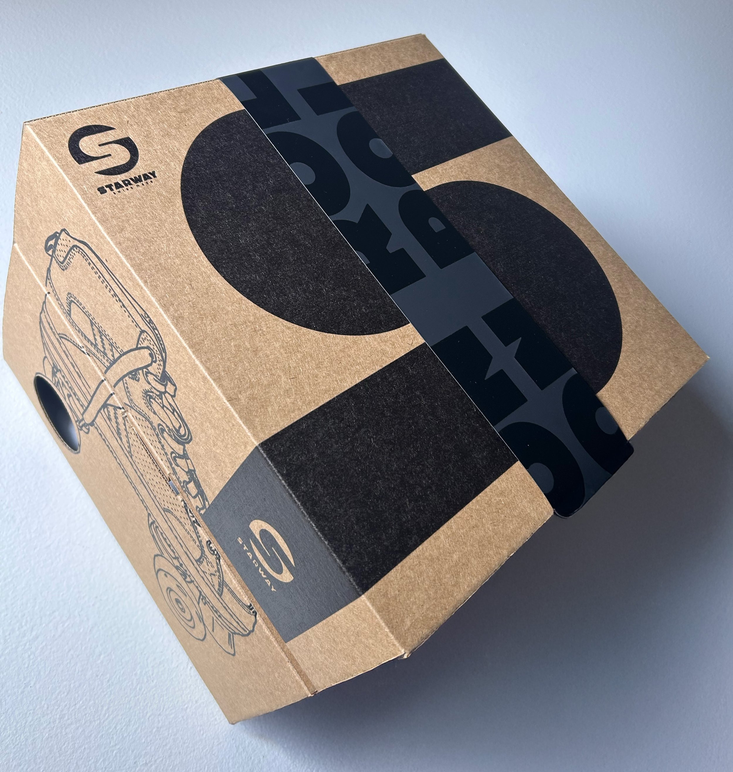
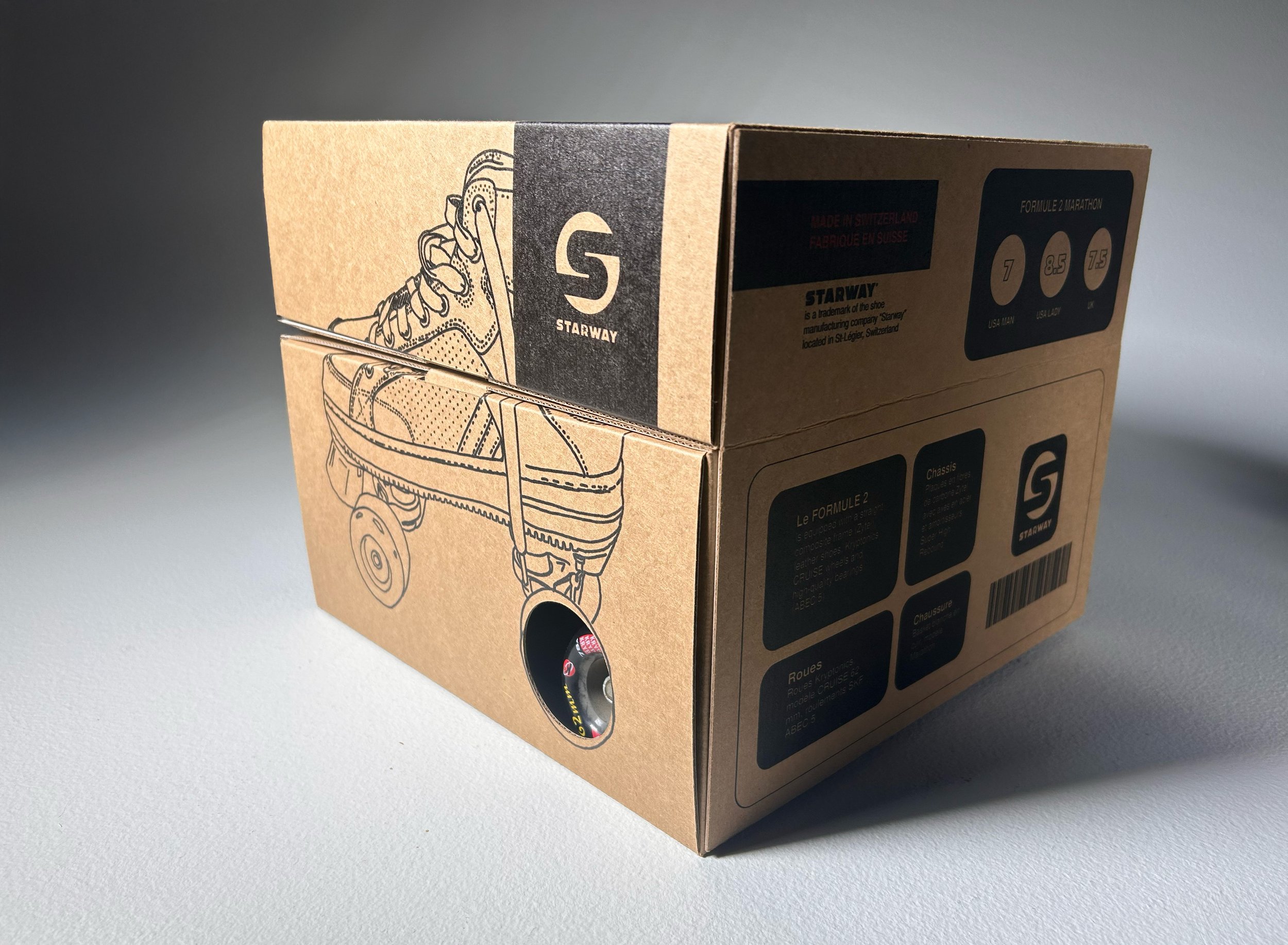
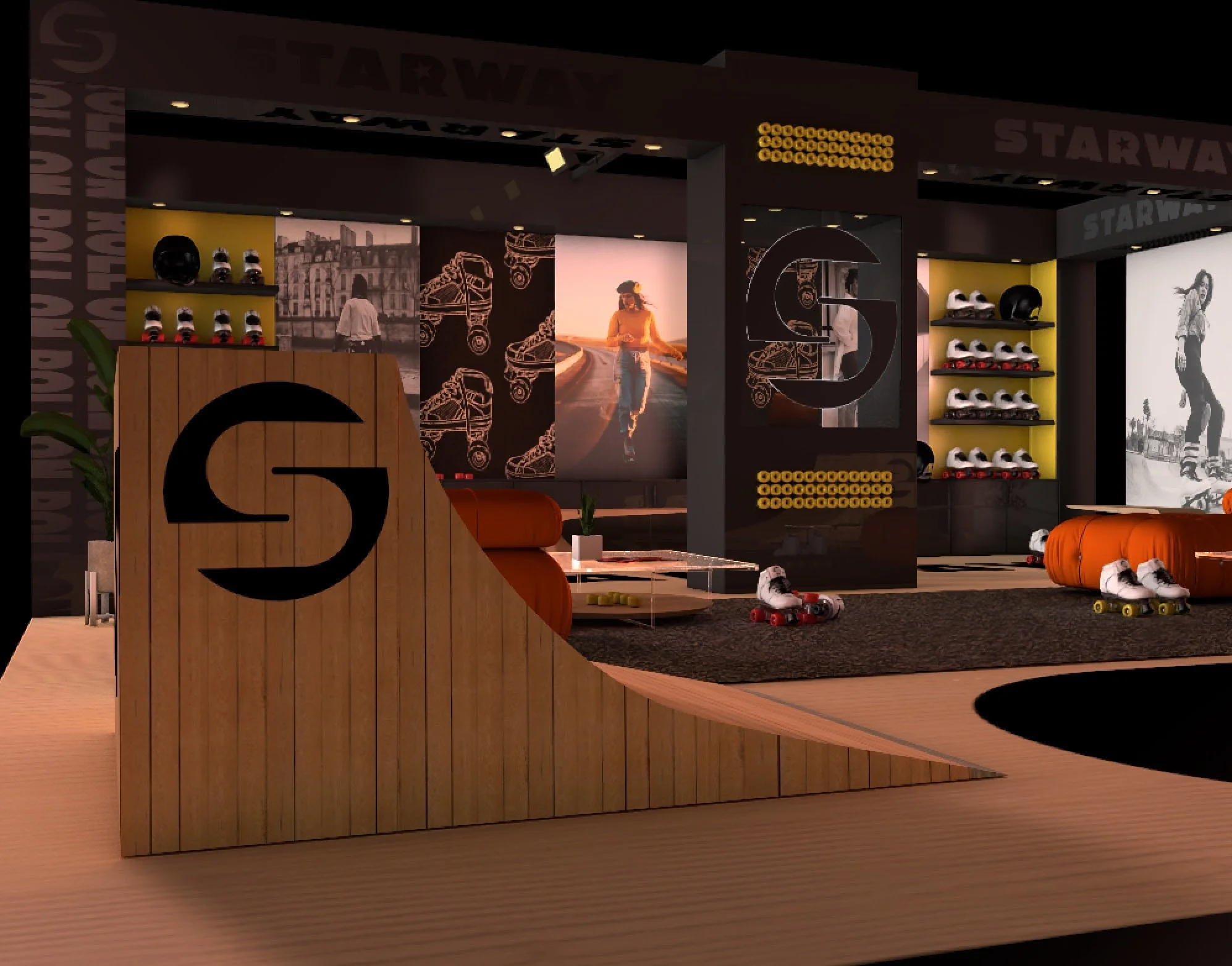
For the Starway brand redesign, the logo was reimagined to reflect the company’s strong connection to street skating. The design features a road-inspired element, emphasizing movement and urban skating culture. The circular shape is subtly enclosed within an implied square, referencing Switzerland’s association with geometric precision and its uniquely square flag. This redesign balances dynamic motion with structured form, creating a visual identity that is both bold and deeply rooted in the brand’s heritage.